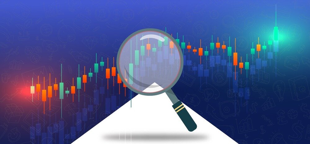

In the whirlwind of the Indian stock market, understanding the market data by reading the numbers pretty much becomes impossible. So, to simplify this process, traders use many tools, and one of the most essential tools in a trader’s arsenal is candlestick charts. It’s like a visual storyteller, encapsulating the nuances of price movements in a visually engaging and easy-to-interpret format.
They serve as a guiding light, empowering traders to navigate the complex maze of the market. But these candle sticks are no less than a devil’s trident for someone new in the trading game. Nothing to worry about. We are here to answer your search for “candlestick charting explained.” We will help you decipher the art of reading candlestick charts.
What Is Candlestick Chart in Day Trading?
Imagine a graph that shows how a stock’s price changes. Each block on this graph is like a candle, showing the opening, highest, lowest, and closing prices.
Composition of a Candlestick Chart
- Body: Think of this as the central part of the candle. If it’s green or empty, the closing price is higher than the opening price. If it’s red or filled, the closing price is lower.
- Wicks (Shadows): These stick out from the top and bottom of the candle. They show the highest and lowest prices during that time, showing how much the price changed.
How to Analyse Candlestick Chart?
Once you understand how the body and wick work, it is time to decipher the technique of candlestick chart analysis, which, as in the Indian market, is an essential skill for any trader. It’s not just about numbers; it’s about understanding the visual cues these charts provide to predict potential price movements. Here’s a practical guide to navigating candlestick charts:
Identifying Trends
Imagine these charts as a sequence of clues guiding you through market trends.
Upward Trends (Bullish): Look for a succession of candles with closing prices consistently higher than their openings. It signifies a positive trend, indicating potential price increases. So, in layman’s terms, the upper limit of the candle’s body shows the closing price, while the lower limit shows the opening price, the upper wick shows how high the price has gone during the session, while the lower wick portrays how low the price has gone. The absence of a wick on the upper means that the closing price was the highest, while the absence of the lower wick indicates that the opening price was the lowest.

Downward Trends (Bearish): Here, candles generally close lower than they open, signaling a negative trend and potential price declines. Interpreting it is the same as a bullish candle, but it’s upside down. The upper limit of the candle’s body shows the opening price, while the lower limit shows the closing price. In contrast, wicks work the same way. But their absence is also flipped over a bullish chart. No upper wick means that the opening price was the highest, and the absence of a lower wick means the closing price was the lowest.
Spotting these trends is like recognizing the rhythm of the market, giving you a glimpse into its direction.
Candlestick Chart Patterns
These patterns are markers revealing potential shifts or continuations in the market’s momentum.
- Reversal Patterns: Keep an eye out for specific candle shapes indicating possible changes in market direction. These can hint at shifts from bullish to bearish or vice versa.

- Continuation Patterns: Other patterns suggest the likelihood of the market maintaining its current trajectory.

Understanding these patterns equips you with the ability to foresee potential market movements, empowering you to make informed trading decisions. So let’s look at some bullish and bearish patterns that can be seen in the market.
Bullish Patterns
- Hammer: This pattern emerges as a small candlestick with a short body and a long lower wick. Typically seen after a downtrend, the hammer suggests a potential reversal towards an uptrend. It signifies a strong influx of buyers who propelled prices higher from their lows.
- Bullish Engulfing: Characterized by a larger bullish candle that engulfs the preceding smaller bearish candle, this pattern signals a shift from bearish to bullish sentiment. It indicates intensified buying pressure, potentially leading to higher prices.
- Morning Star: Consisting of three candles, a bearish candle, followed by a small indecisive candle, and a bullish candle, the morning star pattern signals a potential reversal from a downtrend to an uptrend. It represents a transition from selling to buying pressure, hinting at an upward market movement.
Bearish Patterns
- Shooting Star: Represented by a candle with a small body and a long upper wick, the shooting star often appears after an uptrend, suggesting a potential reversal to a downtrend. It indicates a struggle between buyers and sellers, potentially leading to a market downturn.
- Bearish Engulfing: Identified by a larger bearish candle engulfing the preceding smaller bullish candle, this pattern reflects a shift from bullish to bearish sentiment. It highlights increased selling pressure, potentially leading to lower prices.
- Evening Star: Comprising three candles—a bullish candle, followed by a small indecisive candle, and a bearish candle—the evening star pattern indicates a potential reversal from an uptrend to a downtrend. It signifies a shift from buying to selling pressure, indicating a possible downward market movement.
By delving into these charts and understanding the tales they tell, traders gain a valuable edge in anticipating market trends and positioning themselves strategically in the dynamic world of the Indian market.
Conclusion
Mastering the art of interpreting candlestick charts is important for deciphering the nuanced language of the market’s flow. By understanding the nuances within candle composition, unraveling intricate patterns, and embracing the bullish and bearish sagas they depict, traders can craft their own trends in the tumultuous yet vibrant landscape of the Indian stock market. These visual renditions unravel market sentiments, offering traders a brush with predictive insights to navigate the ever-evolving world of trading in India.
FAQs
What is a candlestick chart?
A candlestick chart is a visual representation of price movements in financial markets. It shows the open, high, low, and closing prices within a specific period, helping traders analyze market trends.
How to understand a candlestick chart?
Candlestick charts use candle-shaped symbols to display price movements. The body of the candle represents the price range between the opening and closing prices. The wicks (shadows) indicate the highest and lowest prices during that period. A green or hollow body signifies a bullish market, while a red or filled body suggests a bearish market sentiment.
How to draw trendlines on candlestick charts?
To draw trendlines on candlestick charts, identify at least two significant highs or lows and connect them using a straight line. For an uptrend, draw a line connecting higher lows; for a downtrend, connect lower highs. These lines help visualize the direction of the market trend.
I’m Archana R. Chettiar, an experienced content creator with
an affinity for writing on personal finance and other financial content. I
love to write on equity investing, retirement, managing money, and more.